Were your quilting colors this year “So 2026”?
Try this fun quiz to see whether your fabric pulls have been quietly following the year’s color story — or writing one of their own.
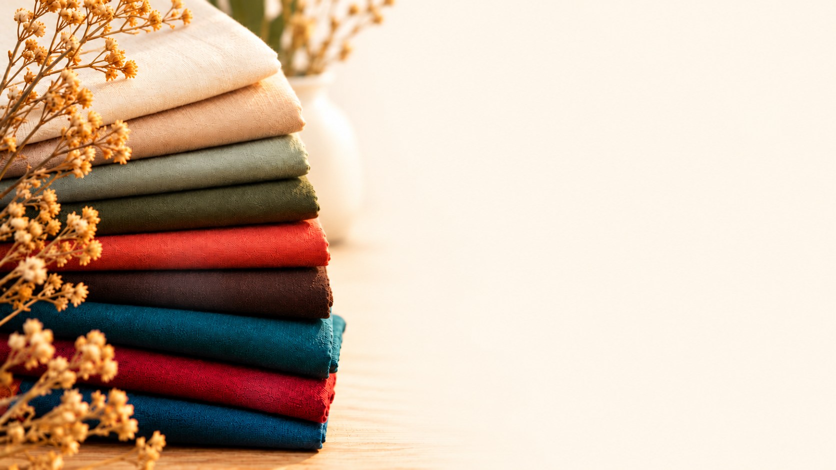
2026 Color Trends
Warm Cream
Soft, warm neutrals take the lead.
Sage Green
Nature-inspired greens continue to grow.
Teal
Jewel tones bring depth and saturation.
Moss
Rich, natural olive tones add depth.
Espresso Brown
Rich browns are back as a grounding neutral.
Cranberry
Deep red accents remain popular.
Terracotta
Earthy, sunbaked tones add warmth.
Bright Accents
A small pop of tomato or citrus adds energy.
Prussian Blue
Deep, inky blues add quiet drama.
The “How 2026 were you?” quilt-color quiz
1. Your go-to light background this year has been…
- A. Cream, oatmeal, mushroom or a soft off-white
- B. A mix of warm and cool neutrals
- C. Whatever makes the quilt sing — icy gray, optic white, hot pink… no trend forecast required
2. You bought green. Which green?
- A. Sage, moss, eucalyptus or smoky jade
- B. A classic leaf or forest green
- C. Lime, mint, emerald, or a green that refuses to be subtle
3. Brown fabric in a quilt?
- A. Yes — espresso, chocolate, walnut. Suddenly it feels rich rather than dated
- B. Maybe as a supporting neutral
- C. Still not happening — or I never stopped using it in the first place
4. Your dramatic color move was…
- A. Aubergine, cranberry, cobalt, Prussian blue or teal
- B. One deep color paired with familiar neutrals
- C. A full-volume palette with no intention of behaving
5. When choosing several fabrics from one color family…
- A. I layered close shades: sage + moss + forest, or burgundy + dusty rose
- B. I mixed a few related shades but still wanted clear contrast
- C. I reached for opposites, scrappy chaos or a completely different system
6. Your brightest fabric was used…
- A. As a small shot of tomato red, citrus, turquoise, chartreuse or azure
- B. In a few larger areas
- C. Everywhere. Why whisper when fabric can shout?
Your result
Mostly A — SO 2026: You landed right in the year’s strongest color currents: warm, grounded, tonal and nature-led, with deeper colors doing the dramatic work.
Mostly B — TREND-ADJACENT: You picked up some of the mood without letting a forecast run the show. Your palette could sit comfortably beside the 2026 trends without looking like it was built from a checklist.
Mostly C — TRAILBLAZER: You were busy making your own color rules. That may put you outside this year’s dominant forecast — which is exactly how new color ideas start.
A tie — BEST OF BOTH: You’re a bit of both, which might be the most 2026 result of all.
The 2026 color story — in 30 seconds
The broad story was not one “it” color. It was a shift toward warmth, nature and layered color, with deeper shades and bright accents keeping things lively.
- Warm backgrounds took over. Cream, oatmeal, mushroom, warm taupe and soft off-white pushed cool gray out of the spotlight. Even Pantone’s 2026 pick, Cloud Dancer, is a soft, airy white rather than a stark one.
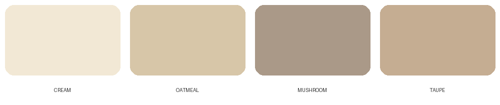
- Nature stayed close. Sage, moss, eucalyptus, terracotta, clay, ochre and rich browns made quilts feel grounded rather than dull.
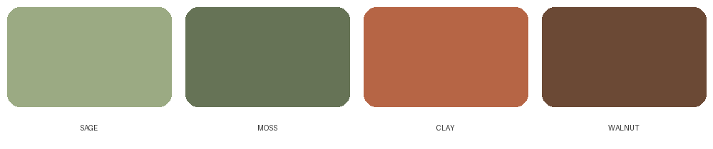
- Brown got glamorous again. Espresso, chocolate and walnut offered depth with a softer edge than black. Benjamin Moore even named a rich, deep brown, Silhouette, its 2026 Color of the Year.
- Drama came in jewel tones. Aubergine, cranberry, cobalt, Prussian blue, emerald and teal brought the richness.
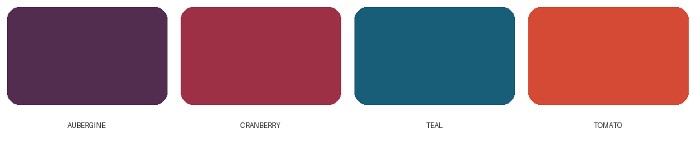
- Tonal became a power move. Several shades from one color family — sage + moss + forest, for example — created depth without relying on hard contrast.
- Brights became the exclamation point. Tomato red, citrus, turquoise, chartreuse and azure worked especially well as a small, unexpected jolt.
Warm, earthy, layered — three words that capture a lot of 2026.
And what was less “2026”?
The clearest contrast was the cool-gray era the year was moving away from. Icy grays, blue-whites and steel-toned neutrals felt less aligned with the dominant 2026 mood. Likewise, very stark black-and-white schemes or ultra-neon palettes sat outside the main warm, earthy story — unless you used them deliberately as your own statement.
“Less 2026” is not the same as “out.” Quilting has a much longer life than a trend cycle.
The best part of the 2026 color story
The most useful idea may not be a particular shade at all. It is permission to mix calm with expressive, old with new, and familiar with one surprising choice. A quilt does not need to look like a trend board to feel current.
If a trend does tempt you, quilting has one advantage over repainting a room: you can experiment first. PatchOwl lets you play with color before you make the first cut. Try a warmer background. Swap black for espresso. Build a tonal version. Add one outrageous accent and see what happens before making a commitment.
Sources & color inspiration
Color forecasting is not an exact science, and different forecasters emphasized different directions for 2026. For this article, we looked at major color forecasts and recent design reporting, then translated those broader ideas into fabric palettes, contrast, backgrounds and color combinations for quilters.
- Pantone — Color of the Year 2026: PANTONE 11-4201 Cloud Dancer
- Benjamin Moore — Color of the Year & Color Trends 2026: Silhouette AF-655
A note on trends: Trend reports are inspiration, not rules — especially in quilting, where the best palette is still the one you want to live with for years.
Start designing the quilt only you could create.
See how PatchOwl helps you turn ideas into original quilt designs—from first inspiration to final layout.
Get StartedAbout the author
Kayoko Stone is co-founder of PatchOwl.